Your personal business case for investing in analytics is simple—you won’t reach the C-suite without data fluency. Wharton’s K.P. Chao Professor Eric Bradlow calls this the “cement ceiling.”
Business analytics has actually been around for a while. What’s different in today’s world is the volume and variety of sources of data, which can be overwhelming. When you have hundreds of millions of rows of data with a thousand parameters, you just can’t use Excel anymore. Without mastering technical tools such as the database communication languages SQL and R—what Excel was 10 years ago—you will be at a competitive disadvantage. However, this doesn’t mean we should aspire to be data scientists. But if you’re going to be working with statisticians and programmers, you need to be able to contribute.
I spent last summer in the Bay Area at a startup that uses machine learning to detect fraudulent behavior online. Educating e-commerce merchants about the intricacies of how our statistical model worked was a very tall order. I resorted to visualizations and relatable stories. Did you know losing one pair of skinny jeans to fraud will take 14 more jeans sold to break even?
That said, data analytics is not for the faint of heart. You’re going to have to do real work. Some of the courses at Wharton are very demanding, and they have opened my eyes to incredibly powerful techniques in business analytics. A professional who knows how to analyze and interpret data for business action will always be in demand. But to be in the top 1 percent, delivering effective presentations with consumable insight, is what will set you apart. We use facts to bridge the credibility gap, but influencing your audience will require knowing who your audience is and what to reveal.
As business professionals, our medium of communication is often presentations and charts. The onus is really on us to choose which visualizations will enhance understanding and offer the clearest access to complex concepts. We ought to take more responsibility in how we furnish and interpret data.

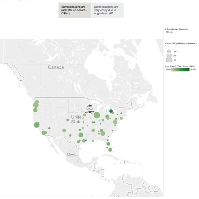
A hackathon data visualization from team Jony’s Crew, made up of second-year MBAs Simran Singh, Indranil Sarkar, Jon Yeow and Vikram Madan, W’09, C’09
That’s where data visualization comes in—and exactly why I was inspired to create the Wharton Data Visualization Hackathon.
Planning a “hackathon” at a business school was a joy and a challenge. Thankfully for us, we have powerhouse research arms right in our backyard, such as the Wharton Consumer Analytics Initiative (WCAI), co-directed by Professor Bradlow and Frances and Pei-Yuan Chia Professor Peter Fader. We leaned heavily on WCAI’s academic research experience and technology resources. The enthusiastic involvement from both the undergraduate and graduate students—we had 40 students in 10 teams participate in the event on Feb. 27, 2015—was really a testament that data analytics is not just a fad. It’s just getting started.
For some, in fact, it’s actually turned into quite a passion.
Monica Wojciechowski, a junior in the Jerome Fisher Program in Management & Technology, couldn’t resist participating in the hackathon.
“When I heard that Wharton was going to host a data visualization hackathon, I was immediately ready to take part. The opportunity to set aside some time to learn about current visualization techniques, interact with others as interested in the field as I am and have access to real data from a national car rental company genuinely interested in our insights sounded too good to be true,” she says.

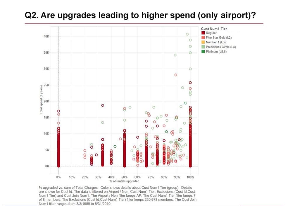
A hackathon data visualization from Team M&T, made up of M&T juniors Monica Wojciechowski, Karan J. Hiremath and Timothy M. Miller
The challenge for Wojciechowski and other hackathon participants was to get access to that real-world data and then in less than five hours generate real insights, applicable business recommendations and even an interactive presentation to showcase it all.
“Even more incredible perhaps was that no two teams generated the same insights or visualizations,” she says.
Wojciechowski tells me that she is intrigued by the interaction of structured analysis and creative business communication, and she sees the bigger picture of their value. As popular as the term “big data” has been in the past few years, Wojciechowski believes, “data visualization” will be the next buzzword taking the stage. The world is awash in numbers, and computing and measurement abilities in a vast variety of fields having grown exponentially. The challenge is translating these numbers into something that society can truly consume.
“Creating a visually attractive and valid representation of such data can prove effective in informing the public, changing behaviors and potentially improving the world,” she says.
Wojciechowski also sees the bigger picture for herself in the field of data visualization.
“Data provides boundless ’treasures’ to be found, and data visualization provides boundless ways to share those treasures with the world. In my opinion, this field is a true ‘win-win.’ Not only do you get to find and share the ’treasure,’ you get to show it off as well,” she says.
Editor’s note: Monica Wojciechowski also contributed to the writing of this post. She is a junior pursuing a dual-degree in Systems Engineering and Decision Processes. Originally from Denville, New Jersey, Wojciechowski is currently involved in Alternate Winter/Spring Break, Engineers-without-Borders, Penn Polish Club and Penn Outdoors Club. She is a research assistant in the OPIM department and a Wharton “Passion Project” fellow.


