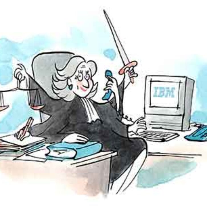
Futurist John Naisbitt is famous for his expression “high-tech, high-touch.” The more arcane technology becomes, the greater is the corresponding need to humanize it—rather like balancing on a seesaw. This imperative has never been greater.
“All Hail the Late Adopter” is the title of a June 2010 article in Wired by Clive Thompson. Its thrust is that makers of technology-intensive products are leaving the proverbial money on the table by catering to leading-edge users while ignoring the lagging edge. Thompson cited the iPad, which resonated with so many seniors who had resisted buying computers because of the perceived complexity of keyboards and mice. The iPad notwithstanding, five years after Thompson’s essay, little appears to have changed in consumer technology.
Consider the television remote control. An article by Geoffrey Fowler in the June 3, 2015, edition of The Wall Street Journal states flatly: “Most remotes are still horror shows.” The “biggest culprit is Sony,” he wrote, with its new Android interface yet a 51-button remote.
This is an historic irony since decades ago, Sony’s Walkman succeeded famously because it had eliminated the “record” function from an earlier version called the Pressman and limited the user to “play”—in the interest of simplicity and portability.
As if TV remote control clutter weren’t enough, consider the jumble of commands across a variety of remotes. Throughout the U.S. and abroad, when trying to retrieve a prior channel, I have encountered at different times A/CH, BACK, FLASH, FLASH BK, FLIP, JUMP, LAST, LAST CH, PREV CH, RECALL, REVERSE and SWAP.
The typical late adopter is likely to be late in years—a boomer or even older, like me. I’m not sure how “smart” I want my next TV to be, but I certainly don’t want its remote control to assault me with 51 buttons. Yet I will gladly spend a bunch for plug-and-play along with easy voice activation.
Too many consumer products reflect technology-as-gadgetry—larded with feature creep. Let’s see how much new stuff we can cram into this device! The user interface, which should be the essential starting place, becomes a final-stage bandage. Such products represent the converse of Ockham’s razor, the notion that the best solution to most problems is that which explains with the fewest variables.
“Entities should not be multiplied without necessity,” said the English theologian William of Ockham, many centuries ago.
Apart from affordability, every product and service competes in terms of three variables: beauty, functionality and accessibility. It is next to impossible to excel across all three criteria simultaneously. Given our aging yet generally affluent population, tomorrow’s opportunity for many companies is a symmetrical blend of beauty and accessibility—in a word, elegance. Apple has historically exemplified such a pattern. Functionality will continue to have its place among the technical elite, but that’s a subset which has been privileged for too long. The smart money increasingly will be on those organizations able induce later adopters.


