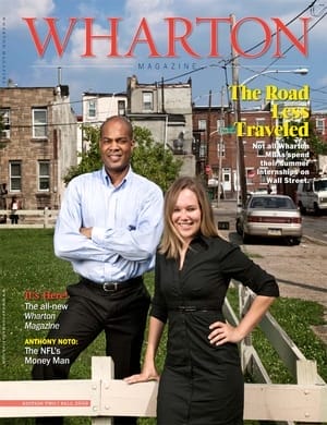
Hot Chocolate-Worthy
I received this magazine recently, entitled Wharton Magazine. I t didn’t seem like my previous Wharton literature, so I put it aside as I rummaged through the rest of the mail. My eyes were drawn to it, though, because it seemed to remind me of Forbes, Fortune or the other interesting business magazines I would go to Borders and read as I sip hot chocolate. As I looked inside, I was just overwhelmed by the new design and the content. It is exceptional. I put it down and said to myself, “This is a magazine worthy of sitting at Borders, sipping hot chocolate, and just reading what is going on in the lives of my fellow Whartonites and my School.”
I look forward to my next issue. You did an excellent job on the new design.
Rupert A. Hayles, Jr., WG’94
Chief Operating Officer, Christ Church
Blairstown, NJ
‘A Grand Slam’
My WG ’69 Class Notes correspondent, Karel Samsom, picked a great issue in which to publish my update. Nothing like optimum visibility in a pleasing, reader-friendly context. The new magazine format is far more inviting than the prior format. Even the lightly-coated paper stock is better than before.
Your design and editorial staff have hit a grand slam. Congratulations.
Jim Rowbotham, WG’69
New York City, NY
And a ‘Home Run,’ Too
At least someone up in Philly is hitting home runs! The new layout and feel of Wharton Magazine is fantastic. For the first time ever, I read the entire thing cover to cover.
Looking forward to the next one!
Scott W. Hawley, C’92, W’92
Vice President of Sales
American Utility Management
Atlanta, GA
From The Other Side of the Earth
I always enjoy when the Wharton Magazine arrives on the other side of the earth from Philadelphia. I enjoyed the latest issue, slightly better than the previous.
Keep up the good work.
P.M. Steckmest, WG’91
Oslo, Norway
In A Bind
I just received my copy of the redesigned Wharton Magazine.
I thought the “old” design was just fine, but it is evident that a great deal of work was put into the new design. I would appreciate learning about the process which said, “Let’s bind it so it won’t lay flat when open and the pages will flip unless held. At the same time, we can make it difficult to read the right side of the left page.”
That makes it very annoying to read, but I’m sure there was a reason. What is it?
Glenn Jacobs, W’67
Lenni, PA
The Editor Replies: Thanks for the note, Glenn. We had originally intended to use a “saddle-stitch” binding on the new magazine, which would have allowed the pages to lay flat, as you suggest. However, because we received so many Class Notes entries, our page count exceeded the printer’s recommended maximum for the saddle-stitch solution. That’s why we chose “perfect-binding,” which while more rigid, made certain that the magazine would hold together. As you’ll see when the winter issue of the magazine arrives in your mailbox, we have switched back to our preferred “saddle-stitch” format, and will continue using it going forward. –T.H.
Send your letters via email to letters@whartonmagazine.com or via traditional mail to: Letters, Wharton Magazine, Wharton External Affairs, 344 Vance Hall, 3733 Spruce Street, Philadelphia, PA, 19104-6360. Letters may be edited for clarity or brevity.